

The most expensive mistake a B2B SaaS company can make isn’t a lack of traffic—it’s the “Clarity Gap” on the pricing page. You spend thousands in ad spend and content marketing driving high-intent traffic to your site, only for visitors to bounce within seconds. Why? Because they cannot instantly grasp the ROI of your software.
In our experience at ExplainerCue, working on over 1,500 projects, we have learned one fundamental truth: B2B SaaS conversion optimization is not about reducing your price or adding more bullet points; it is about reducing the mental friction required to understand why your product is worth the investment. When a technical decision-maker arrives at your pricing page, they are in a high-stakes mindset. They aren’t browsing; they are evaluating risk.
Mastering B2B SaaS Conversion Optimization Through Design
When a CTO or Marketing Manager hits your pricing page, they are looking for one thing: a reason to justify a purchase to their team. If they have to scroll through walls of text or navigate through broken UX to understand your features, you have already lost the sale.
Reducing Cognitive Load with Isometric Animation
Complex SaaS workflows often feel abstract. How do you explain a cloud-based infrastructure or a proprietary API in a few seconds? Isometric animation allows us to transform high-level technical processes into visual stories that are easy to digest. By providing a clear, bird’s-eye view of your ecosystem, you allow the user to mentally “try on” the solution before they even click “Start Trial.”
The Role of 3D Explainer Videos in Building Trust
Static screenshots are often insufficient for demonstrating complex backends. A short, high-end 3D explainer video acts as a trust signal. It shows that your brand is as professional, stable, and forward-thinking as the enterprise-grade solution you are selling. It bridges the gap between a vague product description and a concrete understanding of value.
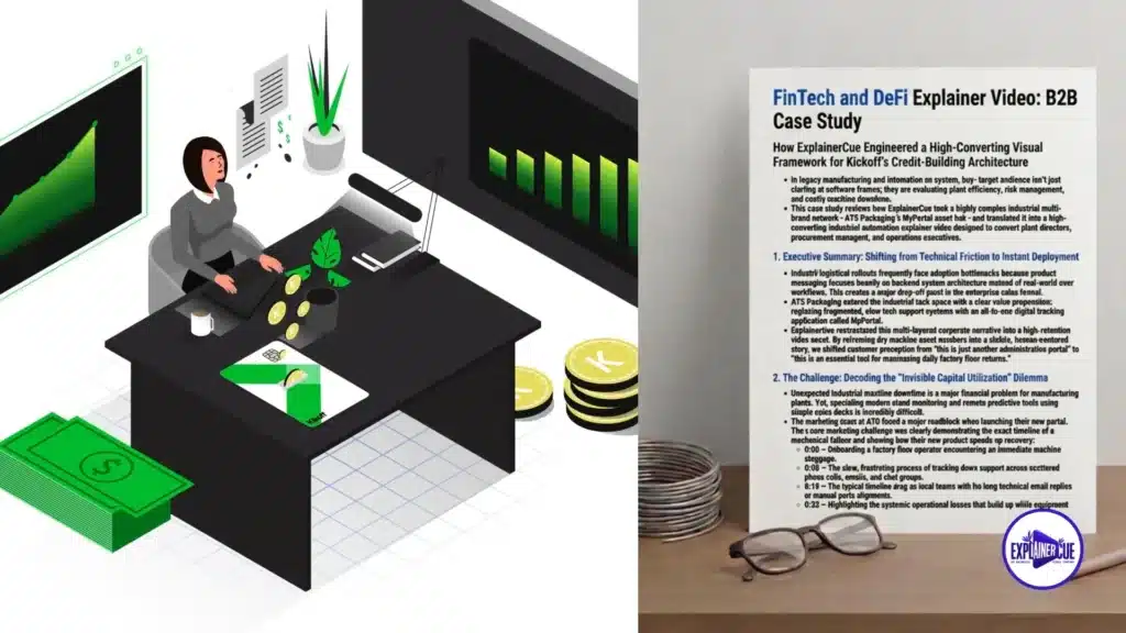
Click here to see full case study
Anatomy of a High-Converting SaaS Pricing Page
To achieve peak b2b saas conversion optimization, your page must function as a guided funnel, not a menu. Here are the core pillars of a high-converting architecture:
- The Power of One: Your pricing table should lead to one logical path per tier. Do not overwhelm users with auxiliary links that take them away from the checkout flow.
- Contextual Social Proof: Place testimonials immediately adjacent to your high-ticket tiers. A quote from a peer in the same industry is worth more than a dozen marketing claims.
- The “Demo-First” Approach: Don’t hide your demo. Integrate a preview or a quick-look clip of your product interface directly into the pricing experience so users aren’t guessing what the dashboard feels like.
- Feature Transparency: Use tooltips or short, punchy descriptors for technical terms to ensure non-technical stakeholders (who often sign the checks) understand the value.
Case Study: Turning Complex Fintech Data into Revenue
In the fintech sector, trust is the only currency that matters. We recently analyzed the performance of several SaaS brands and found that high-conversion Fintech explainer videos were the single biggest factor in moving a user from “Interested” to “Signed Up.”
When we helped a client simplify their backend infrastructure visuals, they saw an immediate shift in user retention on the pricing page. By replacing dense technical documentation with dynamic motion graphics, we allowed decision-makers to visualize their success rather than reading about it. The result was not just a higher CTR, but a better quality of inbound leads who understood exactly what they were purchasing.
See how we bridge the gap in complex industries: Discover our full library of custom motion strategy projects.
Common Pitfalls in B2B SaaS Conversion Optimization
Even with the best traffic, your b2b saas conversion optimization efforts will fail if you hit these common roadblocks:
- The Curse of Knowledge: Assuming your prospect understands the technical acronyms in your pricing table. If they have to Google your features, they are leaving your site.
- Mobile Neglect: SaaS buyers often research on mobile and convert on desktop. If your pricing table breaks on mobile, you lose the lead before they even have a chance to show it to their team.
- Vague CTA: Buttons labeled “Submit” or “Click Here” are conversion killers. Use value-driven CTAs like “Start My 14-Day Growth Trial” or “Scale My Team’s Workflow.”
- Feature Bloat: Don’t list every single minor feature. Focus on the core pain points that the specific tier solves.
Leveraging Semantic Search and Authority
To rank for b2b saas conversion optimization, your page needs more than just the right keyword placement. It requires a content structure that satisfies Google’s E-E-A-T (Experience, Expertise, Authoritativeness, and Trustworthiness) standards.
By integrating detailed, expert-level explanations of why your features work, you demonstrate domain authority. Use H2 and H3 tags effectively to break down your page into digestible sections, which helps both the user and the search engine crawler map the information hierarchy of your site.
Final Thoughts: The ROI of Clarity
Your pricing page is the final stage of your sales funnel. If it lacks clarity, your hard-earned traffic is effectively being wasted. By utilizing intentional motion design and a user-centric layout, you can turn a “looker” into a “booker.”
Remember: the goal of b2b saas conversion optimization is to remove the obstacles between a user’s problem and your solution. When you use motion graphics to bridge that gap, you aren’t just improving your design; you are directly impacting your bottom line.
Ready to turn your pricing page into a lead-gen machine? Schedule your complimentary motion design consultation today.