
Tech products suffer from a unique visual crisis: you are selling invisible logic. Whether it is an AI-driven analytics engine, a decentralized blockchain protocol, or a multi-layered cloud infrastructure, your core value proposition cannot be physically held or easily photographed.
When B2B marketing leaders try to showcase these complex systems, they usually hit a wall. Static dashboard screenshots look flat, uninspired, and completely fail to convey the scale of the software architecture running behind the scenes.
Conversely, investing heavily in full cinematic 3D rendering frequently backfires. It can feel clunky, distracts from the core user interface, and introduces bloated production timelines that delay critical product launches. This visual mismatch creates an expensive clarity gap on your landing pages, leaving enterprise decision-makers confused about how your ecosystem actually functions.
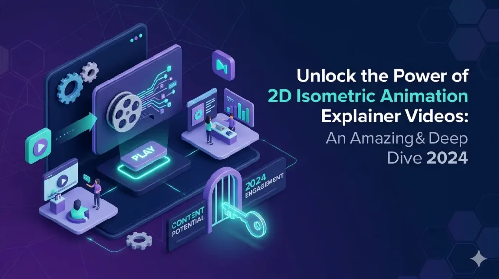
To solve this, industry-leading tech brands utilize a specific visual framework: isometric design. For organizations looking to implement this, partnering with expert isometric video animation services in us is the standard for translating abstract technical concepts into a clean, professional visual language.
Table of Contents
The Technical Superiority: Breaking Down the 3D-on-2D Illusion
To understand why this design language dominates the enterprise tech sector, you have to look at how it manipulates space to favor technical clarity.
The Power of Parallel Perspectives
Traditional 3D perspectives utilize vanishing points, meaning objects shrink and warp as they move further away from the camera. In a tech product demonstration, this distortion is a critical flaw. Isometric design relies on a precise 30-degree parallel grid where scale remains completely uniform across the entire canvas. This mathematical precision ensures that data metrics, UI buttons, and network nodes remain perfectly legible and unwarped, no matter where they sit on the screen.
Mirroring Modern Software Architecture
Modern tech stacks are built on layers—microservices, APIs, frontend dashboards, and backend databases. Isometric vector layouts naturally mimic this structural reality. By tilting the viewpoint, a motion designer can visually stack your software components, peel back layers of security, and demonstrate how isolated data points connect across an entire ecosystem.
Why Tech Decision-Makers Prefer Isometric Visuals
In our experience at ExplainerCue, busy technical buyers do not want to wade through emotional marketing narratives; they want to see structural capability.
- Visualizing Interconnectivity: It maps out data pipelines flawlessly, showing exactly how an API ingestion feeds into a user interface in real time.
- Maximizing Screen Real Estate: Utilizing the vertical and diagonal planes simultaneously allows you to display multiple features without creating visual clutter.
- Accelerating Time-to-Comprehension: It eliminates cognitive load, helping technical buyers grasp your platform’s operational flow in under 30 seconds.
[Placeholder: Insert Isometric Tech Product Demo Video Here]
Impact on Conversion Optimization and the B2B Sales Funnel
High-authority design does more than look premium—it directly influences your primary growth and conversion metrics.
Building Enterprise Credibility
There is a powerful psychological trigger embedded within architectural, clean isometric lines. It subconsciously signals structure, stability, and institutional-grade security. For an enterprise buyer evaluating a new software vendor, this visual maturity builds immediate trust and positions your platform as a reliable, production-ready solution.
Driving Demo Registrations
When a prospect lands on your site and instantly understands your software workflow, their resistance to booking a sales call drops significantly. Replacing abstract copy with a high-fidelity isometric asset bridges the clarity gap, turning confused website traffic into highly qualified leads ready for a live demo.
The ExplainerCue Framework for Tech Product Animation
After working on over 1,500 projects, we have perfected a production system that distills heavy engineering concepts into high-converting visual assets.
- Streamlining Complex Engineering: We don’t just mimic your source code or replicate every minor dashboard link. Instead, our design team acts as product strategists. We strip away non-essential visual noise, focusing entirely on the high-value data paths, triggers, and integrations that differentiate your product from legacy competitors.
- Kinetic Energy and Data Flow: A world-class tech explainer relies on smart kinetic motion. We use illuminated data pulses, smooth vector transitions, and dynamic camera pans across the isometric plane to tell a cohesive story. This tactical direction ensures that your audience’s attention is guided exactly where it needs to go, maximizing engagement from the first second to the final frame.
Turn Your Tech Architecture into Your Strongest Sales Asset
Your engineering team spent years building a sophisticated, highly scalable product—do not let flat, uninspired marketing assets hide its true power from the market. Let us help you close the clarity gap, command the attention of enterprise decision-makers, and build visual assets that scale your sales pipeline.
Ready to elevate your tech product marketing? Book an Animation Strategy Audit with ExplainerCue today, and let our motion design strategists blueprint your product’s visual breakthrough.